Journey of Hope
A non-profit organization dedicated to supporting women and girls who have been victims of domestic violence.

The Problem
Users of the Journey of Hope site struggled to find volunteer or donation opportunities due to the unorganized site, unclear mission statements, and difficulties verifying legitimacy, leading to frustration and missed chances with the organization.
My Role
Lead UX researcher, UX designer
The Solution
We created clearer content hierarchy within an updated sitemap, reprioritized and simplified the mission statement, and created a simple and clear list of ways to support Journey of Hope (JOH).
Constraints
This project was completed in a single 3 week sprint, focusing on mobile first redesign of the home page, support pages, and mission and history page.
Background
Current Site
The site as it stands is very text and photo heavy, much of which is unrelated to the goal of the site: raise money, provide resources, and engage potential volunteers.


Research
Competitor Analysis
After reviewing the JOH site, we wanted to see where it stood compared to it's peers. We looked into four non-profit's that focus on supporting victims of domestic violence. The first thing that stood out was the clearly structured information architecture of each site. Services offered, ways to support, and about the organization were clearly included on all the sites we reviewed.
User Research
Next, we conducted user interviews and a survey to generate insights into what motivates or discourages experienced non-profit organization (NPO) supporters from supporting a new NPO.
User Interviews
We spoke with 5 users who frequently interact with non-profit organizations. This is what we found.


-
Users struggle to trust and verify NPOs due to unclear information and poor online presence.
-
Finding relevant causes is difficult due to overwhelming information.
-
Engagement increases when NPOs align with user interests and experiences.
-
Unclear calls to action and inaccessible websites discourage engagement.

Survey
We received 20 responses on a quantitative survey from users who have supported at least one NPO in the past.
-
58% of participants preferred to volunteer over other kinds of support.
-
85% of participants want a personal connection to the NPO they support.
-
77% of participants stated that an NPO’s reputation was influential or very influential in their decision to support.
Users need information that fosters authenticity and credibility about an NPOs' impact and values to ensure it aligns with their own.
Our User
Our interview and survey data revealed the pain points that users like Emily face when engaging with a new non-profit organization.


Information Architecture
With our research findings front of mind, we tackled the information structure of the site. Our priority became simplifying how people donate and volunteer, while also ensuring our mission and values are clearly visible and central to their experience.

The Features
After conducting "I like, I wish, What if" to collect further feedback on the site, we prioritized site features using the MoSCoW method. We decided to focus on making the donation and volunteer process more straightforward and making the values and positioning the mission statement such that it is front of mind for users.
Lo-Fi Prototype and Usability
Our first iteration of the layout focused on making it: simple for users to find the information they needed, easy to find ways to volunteer, and intuitive to both donate to and contact the organization. We took a mobile first mindset with this site, ensuring that the most crucial elements of the design are easily accessible on the smallest screen. This is what our users found:

Positives
-
Intuitive
-
Easy to find navigation
-
Easy to sign up
-
Easy to find desired information
Pain Points
-
Tried clicking on volunteer opportunity title (which was not linked) instead of photo
-
Wanted a back button on each opportunity page
-
Difficulty grasping tasks without proper body text
Hi-Fidelity
Style Guide
Before we embarked on our Hi-Fi prototype, each member of the team created a style guide that they felt embodied the feel of Journey of Hope. Then, we dot voted on each aspect of the style guides to bring together the best aspects of each one.

We ended up with a style guide that helped us create a minimal and cohesive site visually, while also keeping the critical aspects of the original site: purple (the color of domestic violence awareness) and butterflies (symbols of hope and new beginnings).


Scroll to see our colors, fonts, icons, and buttons.
Prototypes
With a solid UX foundation, and our style guide components set, we moved on to our mobile hi-fi prototype. We implemented the feedback from our usability test, such as the "back" button on volunteer opportunity pages, and making volunteer opportunity titles clickable.


From there we moved to tablet...
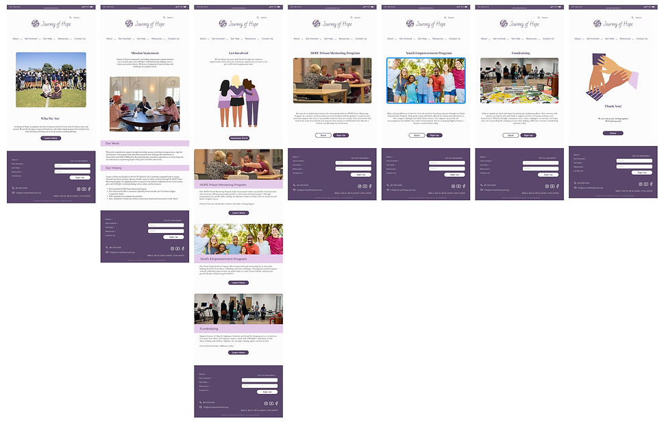
And finally, desktop.

Reflection
Expected Impact
-
Improved clarity – Users can now quickly understand the mission and impact.
-
Enhanced user engagement – A clear structure guides users to volunteer/donate seamlessly.
-
Increased trust – Transparency in financial reports and testimonials reassures potential supporters.
Key Learnings
This project reinforced my UX problem-solving and research-driven design approach:
-
User Research is Key: The insights gained from testing directly shaped our design decisions.
-
Clear IA is Crucial: Simplifying navigation significantly improved usability.
-
Accessibility & Visual Hierarchy Matter: Structuring content effectively prevents cognitive overload.
-
Iteration Strengthens Design: Testing helped refine solutions that aligned better with user needs.